A beautiful print can fall flat for one simple reason – it was never given the right conversation with the room. The question of how to style art prints is rarely about rules alone. It is about mood, balance, memory, and the feeling you want a space to hold when you walk into it.
Art prints have a quiet kind of generosity. They make meaningful art more accessible, but they also offer freedom. You can build a room around one print that stirs something in you, or gather several works into a story that reflects where you have been, what you love, and how you want to live. Styling them well is less about making your home look finished and more about making it feel true.
How to style art prints starts with feeling
Before choosing frames or measuring walls, pause and ask what you want the room to say. A bedroom may ask for softness, stillness, and space to breathe. A hallway can carry movement and curiosity. A dining room often welcomes bolder energy, conversation, and richer contrast.
That emotional starting point matters because art does not live separately from a space. A botanical print with open, airy tones may feel peaceful in a bedroom, but too quiet above a dramatic dark velvet sofa. A vivid wildlife print may bring thrilling life to an entryway, yet feel overstimulating in a meditation corner. Styling begins when you notice that art changes the emotional temperature of a room.
If you are choosing between several prints you love, let the room decide with you. Not every beautiful piece belongs everywhere. The strongest interiors are rarely built from random good taste. They are built from resonance.
Let scale do some of the work
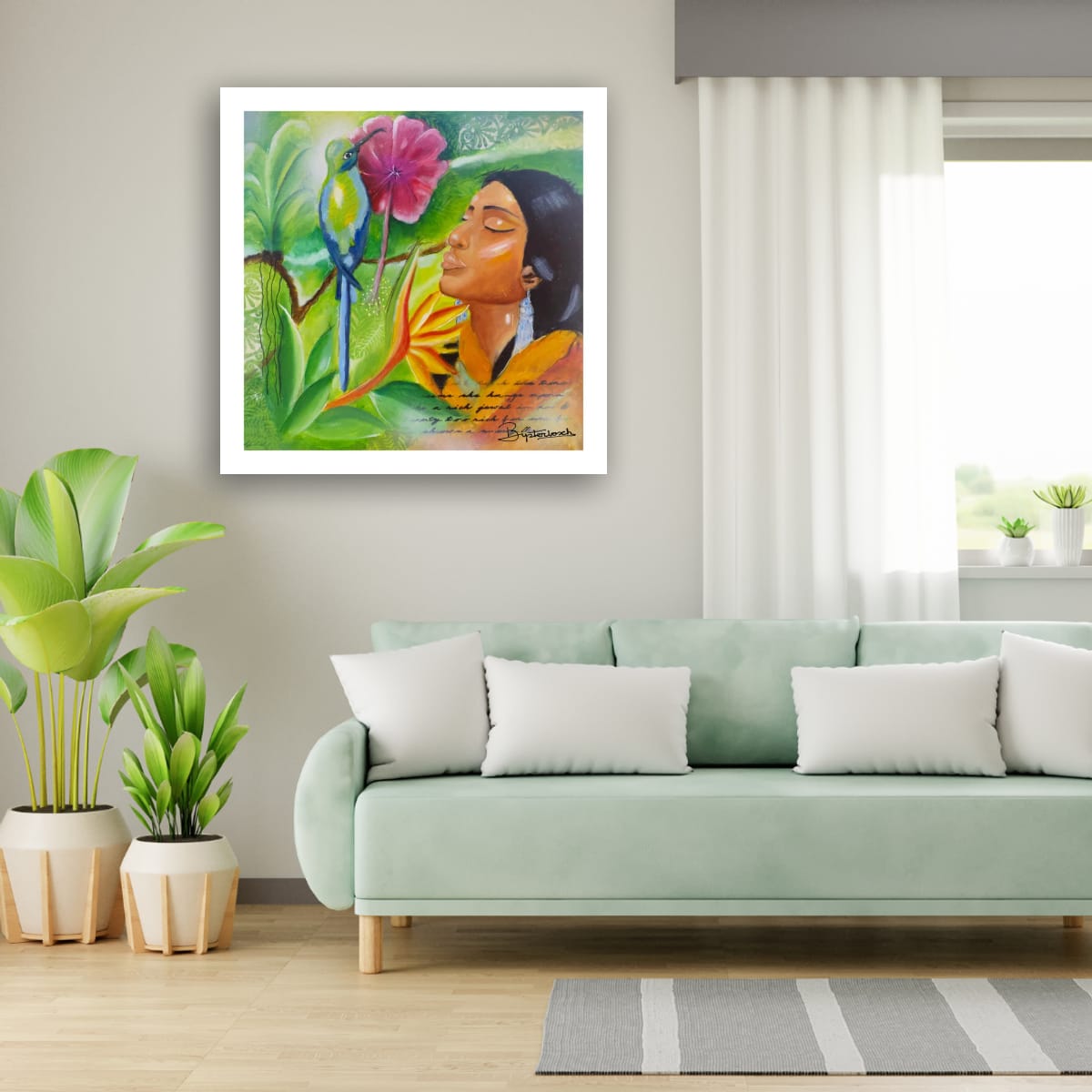
One of the most common styling mistakes is choosing art that is too small for the wall or too timid for the furniture beneath it. Prints need enough presence to feel intentional. If you hang a modest piece over a large sofa, sideboard, or bed, it can look adrift.
A good visual anchor usually spans around two-thirds to three-quarters of the width of the furniture below it. That does not mean every room needs oversized art. It simply means the relationship between the print and its surroundings should feel considered.
Large prints create atmosphere quickly. They suit spaces where you want an immediate emotional statement, especially if the artwork has expressive color or a strong subject. Smaller prints can be just as powerful, but they tend to work best in pairs, clusters, or gallery-style arrangements where they create rhythm together.
There is always some flexibility here. If you love a smaller work, give it more weight through a larger mat, a substantial frame, or by placing it where intimacy makes sense, like beside a bookshelf or above a writing desk.
Frame for the artwork, not just the trend
Framing shapes how a print is perceived. It can make a piece feel refined, relaxed, contemporary, warm, or architectural. The right frame does not compete with the artwork. It gives it a home.
Light oak and natural wood frames often bring warmth and softness, especially with nature-inspired art, portraits, and earthy palettes. Black frames add definition and can make expressive or graphic work feel more grounded. White frames tend to disappear visually and can be useful when you want the image itself to lead.
Mats also matter more than many people expect. A generous mat gives a print air and significance. It slows the eye down. This can be especially helpful for smaller works or pieces with intricate detail. If the print is already bold and large, a slimmer presentation may feel cleaner.
Try not to choose a frame because it is currently everywhere. Choose one that deepens the mood of the image and connects to the room. A sleek metal frame in a textured, soulful space may feel too cold. A rustic wood frame in a polished modern interior may feel disconnected. It depends on the conversation you want between art and setting.
Use color with intention, not obligation
Many people assume art prints should match the room exactly. Usually, they should not. A room with too much matching can lose energy. Art is often most alive when it echoes a palette rather than repeating it word for word.
Look for one or two colors in the print that connect with the space through pillows, textiles, ceramics, or furniture. That creates harmony. Then allow the artwork to introduce a note of surprise. Maybe the room is built on warm neutrals, and the print brings in deep green, rust, or cobalt. That contrast can wake the whole space up.
If your room already has strong color, prints with quieter tones can create a needed place for the eye to rest. If your interior is more minimal, a vivid print can become the pulse of the room. Neither approach is better. The right choice depends on whether the space needs calm, depth, or movement.
Placement changes everything
Even a stunning print can feel off when it is hung too high, too low, or disconnected from nearby objects. In most rooms, art looks best when its center sits close to eye level. When placed above furniture, leave enough space so it feels related but not cramped. Usually six to ten inches works well, depending on the size of the piece and the furniture.
There is also the question of what the artwork is facing emotionally. A print above a bed often benefits from gentler imagery and compositions that feel spacious. In an entryway, you can be bolder. This is where a piece with character, travel spirit, or a strong human or natural presence can set the tone for the entire home.
Corners are often overlooked, but they can become deeply charming places for art. A single framed print on a narrow wall, a stack of smaller works on a picture ledge, or a layered arrangement on a console can make a transitional space feel alive.
How to style art prints as a gallery wall
Gallery walls work best when they feel curated rather than crowded. That does not mean they need to be symmetrical or formal. It means there should be some thread holding them together – a common color mood, a shared frame style, a recurring subject, or even a similar emotional tone.
If you want a cleaner look, keep the spacing consistent and use frames in one finish. If you prefer something more collected and expressive, vary the sizes and let the arrangement feel organic, but repeat enough elements so it still feels intentional.
A useful approach is to lay the arrangement out on the floor first. Start with your anchor piece, usually the largest or most emotionally commanding, then build around it. Mix portrait and landscape orientations for movement. Leave breathing room. A gallery wall should invite the eye to wander, not work too hard.
This is also a beautiful way to style prints that carry different memories or inspirations. Travel-inspired works, nature studies, abstract pieces, and portraits can live together if they share a feeling. Story can be the strongest unifier of all.
Layering makes prints feel lived with
Not every art print needs to be centered and formally hung. Some of the most soulful interiors use layering to create ease. A framed print resting on a shelf, mantel, or console table can feel intimate and relaxed. Leaning larger pieces behind smaller objects adds depth and a collected sensibility.
This works especially well in homes where art is part of daily life rather than a fixed display. You can shift pieces seasonally, move them between rooms, and live with them more freely. For collectors and art lovers, this approach often feels more personal.
The trade-off is that layered styling can become messy if there are too many competing objects. Give the print enough visual space. A candle, a ceramic vessel, or a stack of books may support it. Ten decorative items probably will not.
Choose prints that still move you after the room is done
A well-styled home should not make the art feel secondary. The print is not there just to complete the wall color or fill a blank space. It should still speak when everything else is quiet.
That is why the most lasting answer to how to style art prints is also the simplest: begin with art you truly want to live with. A piece that reminds you of wild landscapes, tenderness, courage, or places that changed you will carry more life into a room than something chosen only because it matches the rug.
At Bijsterbosch Art, this is part of the deeper joy of living with prints. They can bring expressive beauty, a sense of travel, and the emotional presence of art into everyday spaces in a way that feels both elevated and deeply personal.
If your home is becoming more thoughtful, more layered, more reflective of who you are, let your art prints do more than decorate. Let them create a feeling you want to return to.